Timo heads up marketing at Digistorm, and although all things brand is his professional passion, Timo’s cringe-worthy celebrity encounters are what he’s known for in the office.
If you jump into your school website's analytics and reports, you'll notice a little metric called the ‘bounce rate.' If you haven't heard of it, essentially your school website bounce rate represents the percentage of users that have landed on your website and leave without visiting any additional pages.
Don't take it too personally, every website has a bounce rate and it's often difficult to determine what constitutes a ‘bad' bounce rate as it largely depends on each school or business' goal. As a quick rule of thumb, a bounce rate higher than 70% usually indicates that there's something about your website that's deterring visitors.
In this post, we'll cover five common factors that negatively affect your school website's bounce rate and how to overcome them.
Optimize your website for mobile
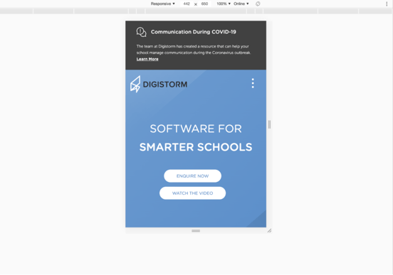
We live in a mobile-first world, which means that the majority of your website visitors will be viewing your website on the go and will expect that your website is mobile-optimized. Let's be honest, if a prospective parent lands on your school website, only to find that navigation is skewed, images don't sit quite right, and the overall user experience is poor, they're going to click off your website out of frustration.
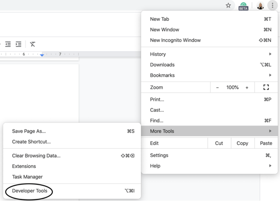
Ensuring that your website is mobile-friendly will also help to improve your SEO, as Google prioritizes mobile-friendly websites in the keyword bidding process. An easy way to preview what your website looks like for mobile users is to open your website on a Google Chrome browser, click on the three vertical dots in the top-right corner to jump into the “Developer Tools”.
Once you're here, click on the mobile and tablet icon, which provides an instant view for how your school website appears on all mobile devices.


Target the right audience with Google Ads
Google Ad campaigns are a great way to get your school website in front of prospective parents, but only if you're actually targeting the right audience. If your Google Ad is getting views and clicks from audiences that don't meet the criteria of your ‘ideal applicant, you're not just draining your budget, but it's likely that you're also impacting your website's bounce rate.
To help you reach your ideal audiences you can break your target groups into fictional personas. Personas are character profiles that you can create to group your school's prospective parents into segments. You can base your personas on a combination of demographic and psychographic information from your pre-existing parents on your school CRM. Parents are more likely to interact with schools that directly meet their needs, so personas are an effective way to understand how to tailor communication and ads to the different segments. You should create three to four personas that include; name, socio-economic background, location, age, gender, interests, core values, and their preferred methods of communication.
Once you've created your personas you can get started with your targeted Google Ads. Gather your marketing team to brainstorm a list of search terms that each persona would be likely to search for – this will be your keywords list. If you're struggling to come up with suitable keywords, try putting yourself in the shoes of your personas to think about what they might be searching for. Another handy strategy is to go through some of your emails with prospective parents to get an understanding of their most commonly asked questions.
Each week you can also check the Google Search Query Report to find keywords that resulted in a website click. This helps you to find new effective search terms to add to your keywords and eliminate any negative keywords that could be attracting unintended audiences. If you're creating Google ads that are specific to your personas, there's a greater chance that you'll be reaching the right audience and therefore, reduce your school website's bounce rate.
Create a consistent landing page for your Google Ad
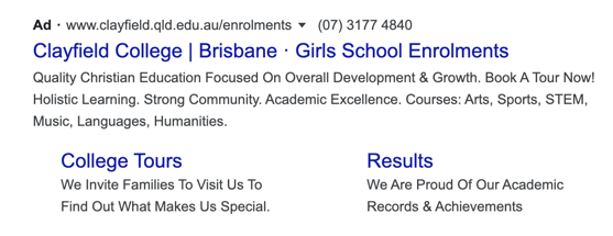
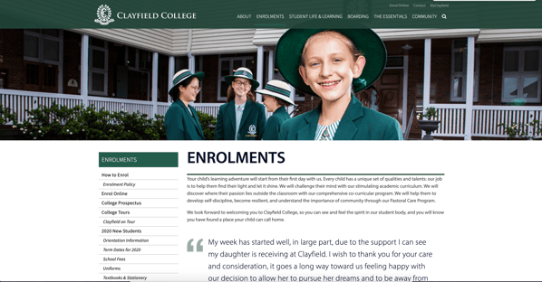
To reduce your website's bounce rate, it's also essential to ensure that your ad reflects your landing page and vice versa. Your visitors should already know what to expect when they click-through to your landing page, based on the key information outlined within your ad. For example, if your ad claims that prospective parents can easily find information about your school's admissions process on your website, ensure this information is front and center on your landing page. Asking website visitors to take additional steps to reach the information they're after is a dangerous game that'll likely lead to an increased bounce rate.
Let's take a look at the Google ad and landing page that Clayfield College has created below. The ad makes great use of keywords in the headline with “Girls School Enrollments” and directs visitors to an enrollment landing page with all of the relevant information once clicked on.
Be sure to keep both your landing page and ad text concise and include all of the key information. If possible, try to avoid overloading the landing page with several images and heavy amounts of text – this can look clunky and is distracting to read.
Focus on the user experience
Once a visitor lands on your school website, you only have a few seconds to capture their attention and convince them to stay. You need to make sure that you're creating a quality user experience to influence them to continue onto your website and make a conversion. Make no mistake, the overall user experience (UX) is strongly influenced by both your school website's design and structure. There are a few steps you can take to help create a successful page layout and user experience, these include:
- Creating an easy to follow page navigation
- Creating a unique but clear website design
- Limiting website pop-ups
You can create effective website navigation through simple layouts and user-friendly language. Try to format your school's website to be accessible through the use of relevant headers and subheadings, appropriate images, and informative text that doesn't overwhelm and flood the page. An initial pop-up on your school website can be appropriate in some cases, however, keep in mind that multiple pop-ups on a website can distract and annoy user's which influences them to click off the site.
Create a clear and relevant call to action
The call to action (CTA) on your website is the instruction or action that you want the user to take as a result of them clicking on your website. This might include filling out a form, booking an open day tour, or clicking on a phone number that will redirect the user to a call. You want this call to action to be clear. If your goal is to encourage online enrollments, you can create an “Enroll Online” CTA that redirects prospective parents to your online enrollment form to reduce the number of steps necessary to make a conversion.


.png)