2024 started with big celebrations for a handful of independent schools acknowledged in the recent InspirED School Marketers Brilliance Awards!
With entrants from right across the globe and 80+ judges scrutinizing the submissions, being named among the winners was no small feat.
As proud sponsors of the awards, we've had the great privilege of combing through the lists in detail and will share below the six schools that inspired us the most.
Forward-thinking, child-centric and dynamic. The projects below prove that a school brand needs to stand out and make a statement.
We understand how little time schools have to craft great marketing and branding, so we build our products to help schools put their best foot forward without too much effort. Sponsoring these awards is how we get a better understanding of trends in our industry—and connect with our much-loved community!
If you love what you see below, check out all the winners here.
1. Paid Advertising - Branksome Hall
 Going straight to the hearts and minds of their future students, Branksome Hall went bold with their paid advertising! Featuring a unique color palette and industry-relevant collage style graphics, this campaign gets our tick of approval.
What the judges said: "LOVE the girl power message! Love the original headlines. I can really "feel" what this school and its students are like through this advertising campaign."
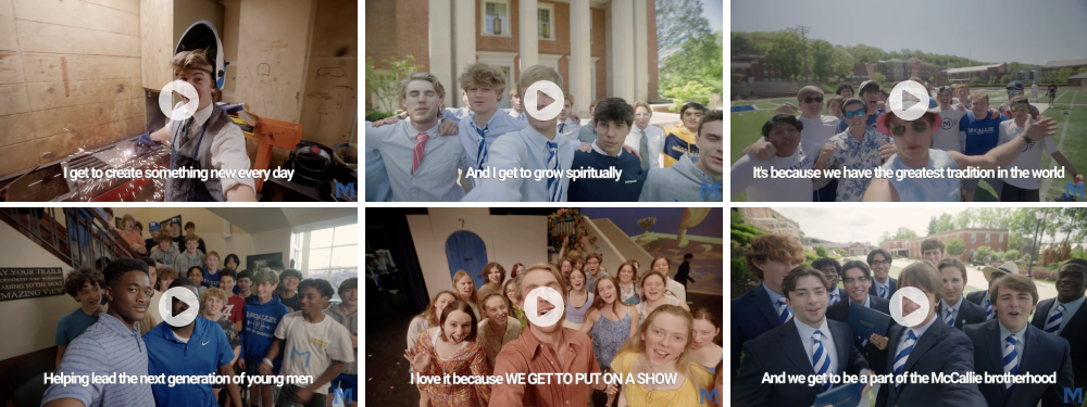
2. Enrollment/Admissions Video, In-House - McCallie School

A lot of school marketing out there portrays students in a very stale, overly polite manner. Meekly practicing the flute, studiously scribing in a book; you know the look. McCallie School decided to call a spade a spade and show their kids behaving like kids. Filled with passion, vigorously taking ownership of their education and pushing the boundaries of life in a safe space. They may scare off a few families, but they'll attract a whole lot more. Honoring your school's values in your marketing is a great way to pull in the right kind of families.
What the judges said: "What I enjoyed about this video was that I could feel the energy and the spirit of the students. It gave a good sense of the school's culture and what it would be like to be a McCallie student. It was simple, effective, appropriately funny, and most importantly, would appeal to the target market — teenage boys."
3. Out Of The Box Concept - Strathcona-Tweedsmuir School

Goodbye, burgundy! Catch ya later, fancy cursive font! Strathcona-Tweedsmuir School have put a whole new spin on branding etiquette for schools—and we're here for it. This design work is vibrant, expressive and filled with character, which lets families know their kids will be free to show their true colors at this school. 10 out of 10.
What the judges said:
"The vibrant colors, strong branding, and the use of "YES" were truly motivating. I'm confident they'll grab the interest of both prospective and current families. With everything from the computer stickers to the vivid and daring website, this brand is poised to stand out in the market."
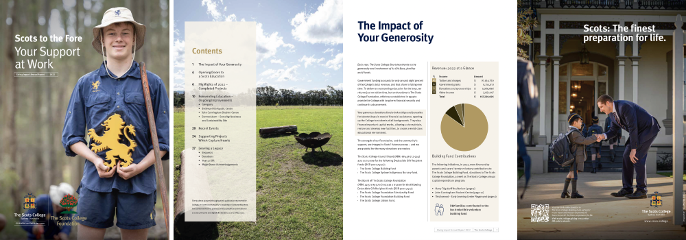
4. Annual Report/Report Of Gifts/Donor Report - The Scots College

Donor communications are a hugely important part of school marketing, but they sometimes get overlooked or swept into a corporate tone and look. The Scots College team have proved there's a better way of doing things, releasing an impressive Donor Report that perfectly balances professionalism and warmth. If you've got an annual report or donation summary coming up, this is the inspiration you need.
What the judges said: "Truly inspiring evidence of donor generosity, compelling visuals (within a very formal aesthetic). QR donor lists are a bold idea. The mix of articles was engaging. I enjoyed reading about the alumni and the developments the funds were providing."
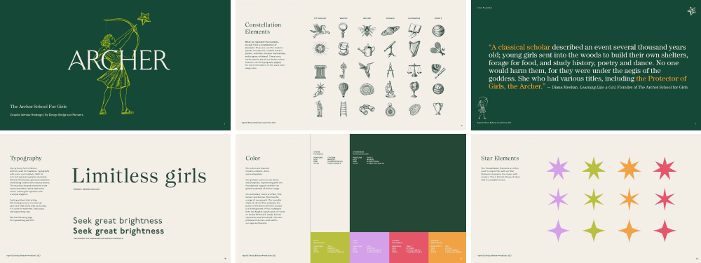
5. Graphic Identity Redesign - The Archer School for Girls

Regal and aspirational yet vibrant and playful, The Archer School for Girls have created a unique identity that perfectly exemplifies the power of graphic design. For schools considering a refresh of their brand image, The Archer School for Girls is a lesson in being courageous. Not to mention it's proof that you don't need to lose the legacy of your school when going modern.
What the judges said: "A very complete identity and the incorporation of the supporting design element were executed on an elevated scale. It reflects a deep understanding of the school's ethos and history, ensuring that the new identity aligns with its foundational values and narratives. The redesign not only respects the institution's legacy but also positions it effectively for future growth and recognition."
6. Still Photography In-House - North Shore Country Day

School photography isn't easy. It needs to be genuine, uplifting and an accurate representation of your school. But frequently it comes off as cheesy, stale and a little like stock photography. Without outsourcing to a professional photo studio, the team at North Shore Country Day have captured the essence of their school with total honesty. It's an invitation to understand just how wonderful school life is for their students. And it lifts the standard in school photography to a whole new level.
What the judges said: "Outstanding work! I was drawn into the scene and the photos were unique, creative, and showed the photographer's ability to push boundaries. BRAVO!"