Throughout our website design series so far, we’ve taken a deep dive into topics such as; motion design, microsites, and the anatomy of a perfect homepage. Now, we’re shifting our focus to one of the more obvious elements that spring to mind when thinking about design: color.
But, there’s a lot more to the story than what you might think.
The way color is used on your school website can influence how your content is consumed, the way users navigate your site, and even the emotions they feel. After you’ve finished reading this post, you’ll never underestimate the power of Color Theory again.
An introduction to Color Theory
There are many ways in which colour can be used to enhance your school website and the overall user experience (UX). For example, did you know that color can guide users toward desired actions or create a hierarchy? Let’s take a look at some of the ways colours might be working to enhance your school’s website design.
Bright colours
Bright colours, like reds and yellows, can be a little tricky to use on websites. When used in large quantities, they tend to distract users from your content and affect the overall usability of your website. To utilize these colors on your website effectively, we recommend using them in smaller ratios or only as highlight colours.
Neutral colors
More neutral colours such as white and shades of black are essential for creating contrasts. They can be used to emphasize brighter colours, as a background, or for creating white space.
Tints, shades, and opacities
Add depth and broaden your school’s colors through tints, shades, and opacities. Say for example if your school’s primary color is ‘sky blue,’ using this color at a lower opacity as a background color instead of at 100% can help to create a more balanced layout.
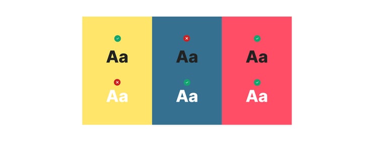
High color contrast
When it comes to colour contrast, we’re talking about the difference in light between the foreground and its background. When this ratio isn’t significant enough, it can affect how users may perceive the information on your website. As there are numerous factors that can impact how color is seen such as; screen brightness and visual impairments like color blindness. High color contrast is essential for better usability – especially elements such as buttons and text blocks.
At Digistorm, our designers work with schools across the world to create engaging websites that showcase their brand and engage prospective families. Let’s take a look now at some examples of how they’ve effectively applied Colour Theory to enhance these websites.
Oakhill College
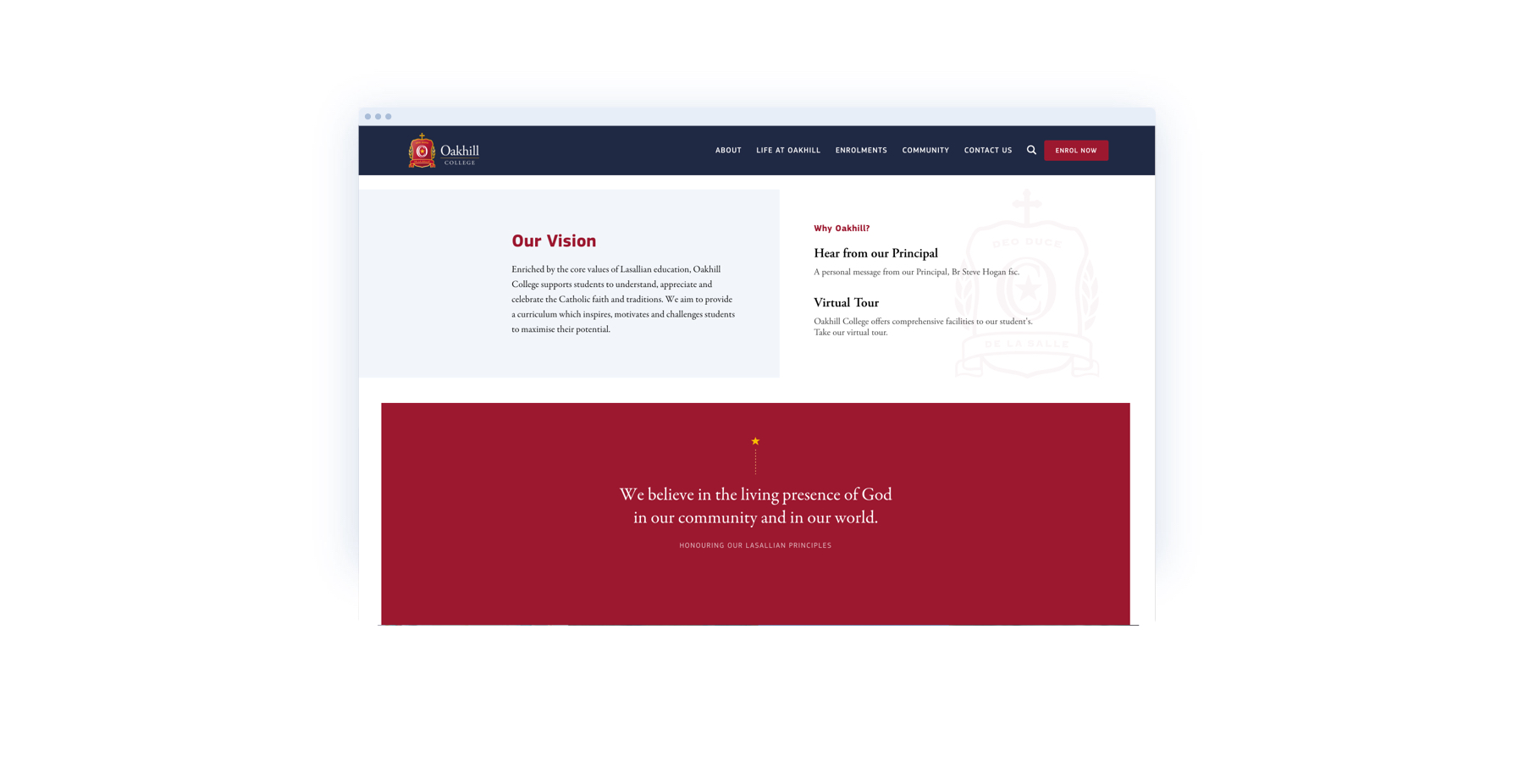 The way colors are designed and placed on your school website should aim to reflect your website’s goals and represent your school’s brand personality. We collaborated with the team at Oakhill College on their new website to achieve just that. The College’s colors have been leveraged in different ratios to emphasise key messaging and call to actions, in order to draw users toward a desired action.
You’ll notice that throughout the website, yellow has been used sparingly as an accent to highlight important elements and to break up content. Navy and maroon are used in a larger ratio and are featured prominently across the website. The use of these colors provides the College with a modern and refined look, whereas the overuse of yellow would create a louder, more chaotic feel for users.
The bottom line: don't be afraid of using your school colors in different rations across your website as it can create a more balanced and interesting color scheme.
Covenant Christian School
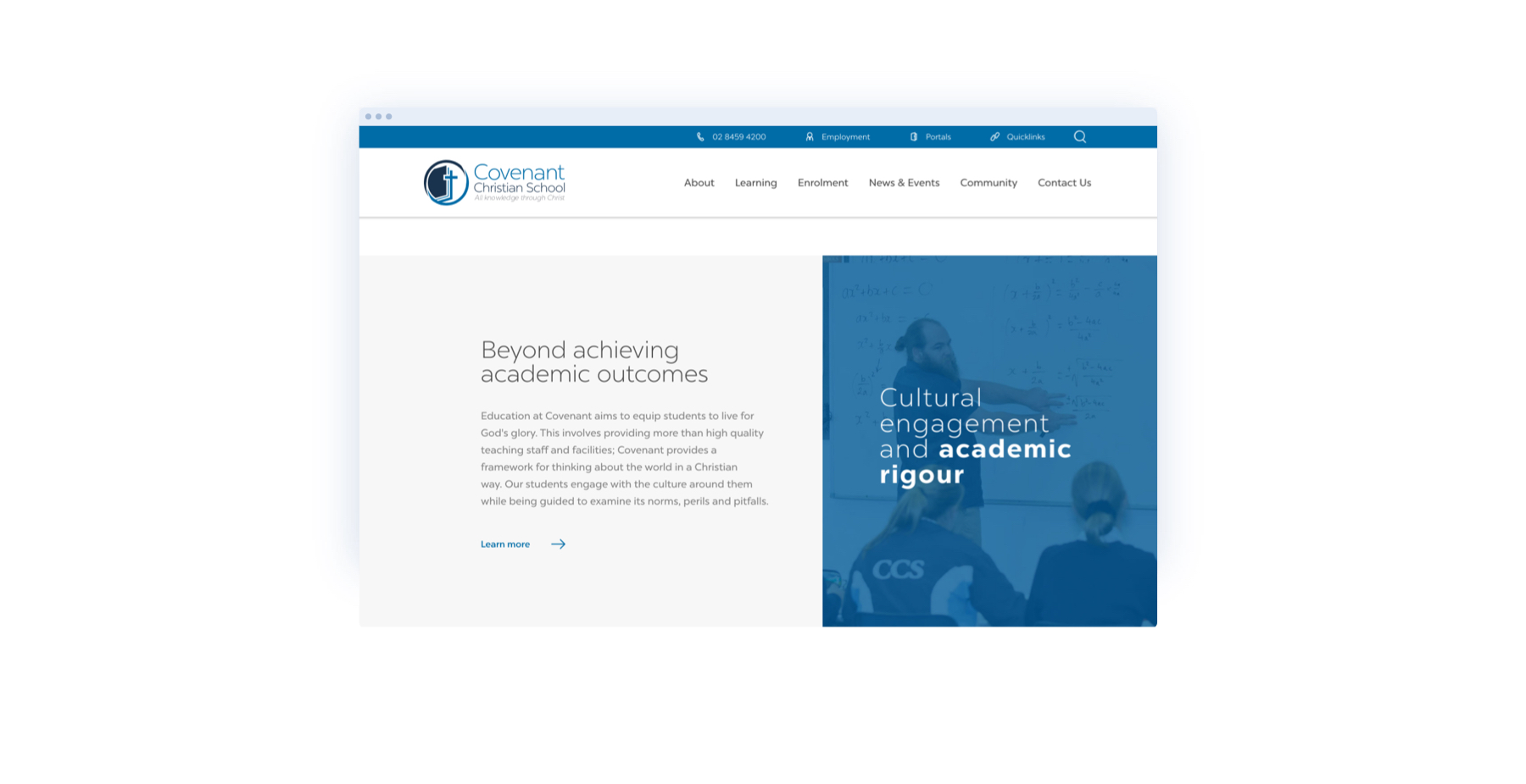 The use of color on Covenant Christian School’s website is not just for aesthetics, but as a way to help guide users to key content too. As you scroll down the homepage, your eye will be drawn to the colorful elements, creating a flow from one content block to another. In this example, blue is used to draw the user to call to actions, key headings, and content blocks. Choosing to use color here emphasizes these elements and influences what users will look at first.
The school’s website also features color combinations with high contrast to assist with readability and accessibility, which as mentioned, is an important design consideration for a positive user experience. We designed dark blue buttons and content blocks paired with white text to create a high contrast colour combination. Websites that use colors with reduced contrast risk users having difficulties deciphering content and using your website. Using an appropriate contrast is just one of the many ways colour helps create an aesthetic and functional website.
Ipswich Grammar School
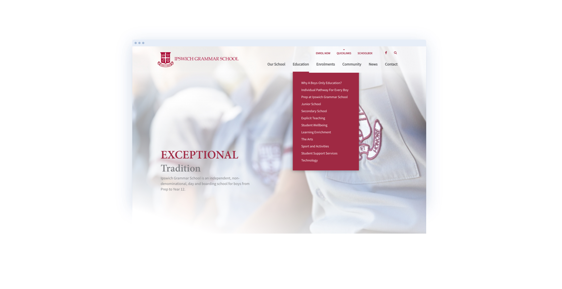
Finally, Ipswich Grammar School’s website is a fantastic example that color can be used effectively, even with just one main color. Red is the school’s primary color and by supporting it with different shades and tones of grey, the website is both aesthetically pleasing and functional.
Red is used to highlight links and within headings to draw attention to high impact words. Thanks to its high contrast against white, red works effectively for small text on a white background, or visa versa. In this example, red guides the user through the homepage toward desired actions and allows users to locate their position within the navigation of internal pages.
Key takeaways
No matter what your school’s colors might be, there’s no doubt that Color Theory plays a crucial role when it comes to designing your school website. Whether your goal is to communicate an emotion, highlight important content, or guide users toward desired actions, using your school colors effectively can help achieve this and more!
.png)