One of the most important branding elements for schools is their colours. They are not only present on your marketing material, but they are also displayed prominently on billboards, within school architecture and on students' uniforms. These colours tell the world about your school and help your community to recognise your brand whenever they see them out in the world.
Most schools find it incredibly important that every touchpoint that a prospective or current family has with their school showcases their brand colours — including their digital channels. This includes their school website, online enrolment form, social media, and of course, their app.
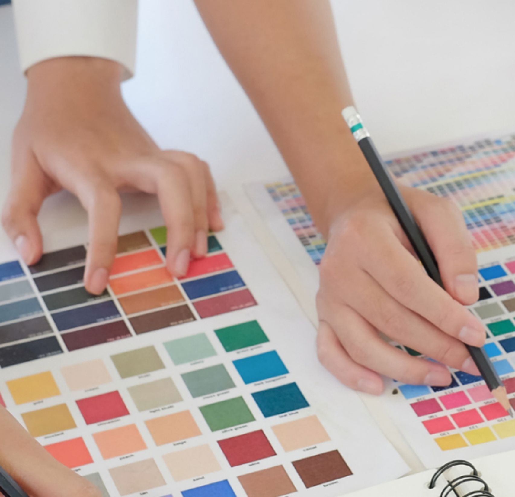
In this post, we talk to one of our designers, Ava, about incorporating brand colours into two school apps: Abbotsleigh and Kennedy Baptist College.
Abbotsleigh app
Abbotsleigh is a private Christian school for girls, located in Wahroonga on Sydney's North Shore. The school offers education from early learning through to Year 12, and offer both day and boarding options. Abbotsleigh uses strong brand colours: black, yellow and white that truly set them apart from other schools. You can see these colours on display in their website, logo and incorporated into the students' uniforms.
Incorporating the Abbotsleigh colours into their school app
The Abbotsleigh colours have been incorporated in the app, along with icons that match Abbotsleigh’s branding. Yellow can be a tricky colour for designers to use. This is mainly because it has a lack of contrast against white, and a high contrast against black. The app dashboard was given a layout that would work well with the school colours, as well as their style of neat, outlined icons. The result was a timeless design that is easy on the eye and works well on small screens.
The app feature image was chosen as this reflects the school uniform. This is something we often do for our apps, as a school’s unique uniform is an important symbol for the school and such images will in almost every case match the colours and style of the app.

Kennedy Baptist College app
Kennedy Baptist College is a coeducational Christian high school, located in Perth's southern suburb of Murdoch. Just like Abbotsleigh, Kennedy Baptist uses strong colours in their branding: dark navy and bright blue. Again, this branding helps to set them apart from other schools, and we wanted this to be reflected in their school app.
Incorporating Kennedy Baptist colours into their app
Kennedy Baptist College’s brand colours offer good contrast against each other, making them work well together. The use of their blue colours make their branding unique, and communicates both professionalism and fun. Neat, outlined icons suited Abbotsleigh's branding, whereas filled, chunkier icons works better in Kennedy Baptist College's app. The filled icons offer better contrast between the different tones of blue, and make this design more intuitive.

The app was giving a unique layout by placing the buttons like tiles across the screen, around an image carousel that is autonomously rotating images, and the school logo. It's not only the school colours and imagery that will set the app apart from others- the layout of the dashboard and unique elements are just as important. At Digistorm, we want to make sure that each school is given a unique product. No matter how many apps we design, each one will be different to the other!
Looking for an app that incorporates your brand colours?
Digistorm has designed custom apps for hundreds of schools in the USA, Australia, New Zealand, the UK and Asia. Our apps are cleverly designed to incorporate all aspects of your brand guidelines to ensure a seamless experience for your community. If you'd like to learn more about Digistorm Apps, talk to our friendly sales team.